What-If
Pick a goal event, nudge transition conversion rates, and watch the share of users reaching that goal move.
What-If turns your transition graph into a conversion simulator. Pick a goal event, then ask one question: if this transition converted better, how much would the overall share of users reaching my goal move?
It follows how users flow through the session transition graph toward your goal, then ranks every transition by how much leverage it has on getting them there. Spend your effort where it pays off instead of guessing.
When to use What-If
Reach for What-If when you know your goal event and need to decide where to invest. It answers the questions the Transitions graph can show you but can't put a number on:
- Which single step, if you improved it, moves the goal the most?
- Do you fix a high-volume transition that already converts well, or a small leak with huge leverage?
- If you lift conversion on two steps at once, do the gains add up or cancel out?
Think of it as a planning tool, not a report. You're testing counterfactuals — "what would happen if" — not measuring what already did. Journey shows you the paths users already take; What-If lets you test paths that haven't happened yet.
Open What-If
What-If is its own analysis level, alongside Events Analysis and Sessions Analysis. It runs on session transitions.
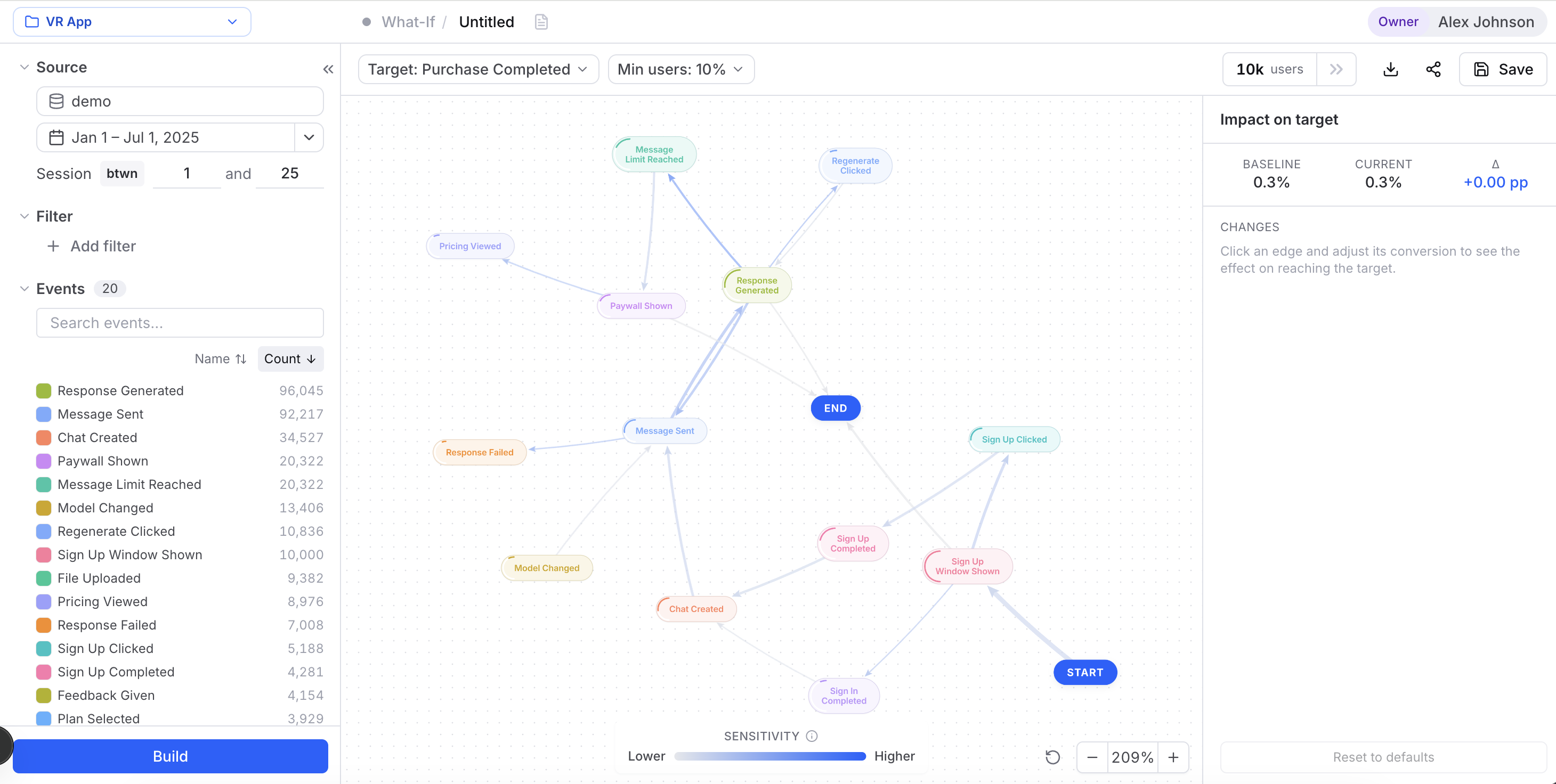
Target: Checkout completed.The left panel does more than it looks. Every filter reshapes the population the simulation runs on, so Baseline, Current, and the sensitivity coloring all shift the moment you scope to, say, mobile users or the last 30 days. See Filters and Session range for what each control does. Two controls from the standard panel are hidden here — the Path window and the Cluster filter kind — and the Events list is read-only: you can filter on events, but you can't rename or exclude them from inside What-If.
Until you pick a target, the canvas just shows a prompt: "Choose a goal event above to see which transitions move users toward it." Nothing computes without a goal.
Read the sensitivity coloring
Set a target and the canvas draws your transition graph with edges colored by Sensitivity — Cohortum's name for per-transition leverage. The ramp runs from faint gray (low leverage) to brand blue (high leverage), with a Sensitivity legend at the bottom of the canvas.
A brightly colored edge is a high-leverage transition: nudge it up a little and a lot more users reach your goal. Faint edges barely move the needle, however busy they look. This is the fastest way to spot where to focus before you touch a single number.
The Min users: N% pill hides low-volume transitions from the graph. Raise it to declutter a dense graph and keep the view on the paths enough users actually take. It's a display filter — it changes what you see, not the underlying model.
Measure the impact
The right panel, Impact on target, is your scoreboard. It shows three numbers:
| Metric | What it means |
|---|---|
| Baseline | Share of users reaching the goal in the unedited graph. |
| Current | Share reaching the goal after your edits. |
| Δ | The change, in percentage points (e.g. +3.21 pp). |
Baseline never moves — it's your reference point. Current and Δ update every time you adjust a transition, so you always see the net effect of your scenario.
If the target event is rare — or never reached at all for the current source and filters — Baseline can read very low or 0.00%. That's expected, not a broken build. Pick a goal that users actually reach, or widen your filters, to see meaningful leverage.
Edit a transition's conversion
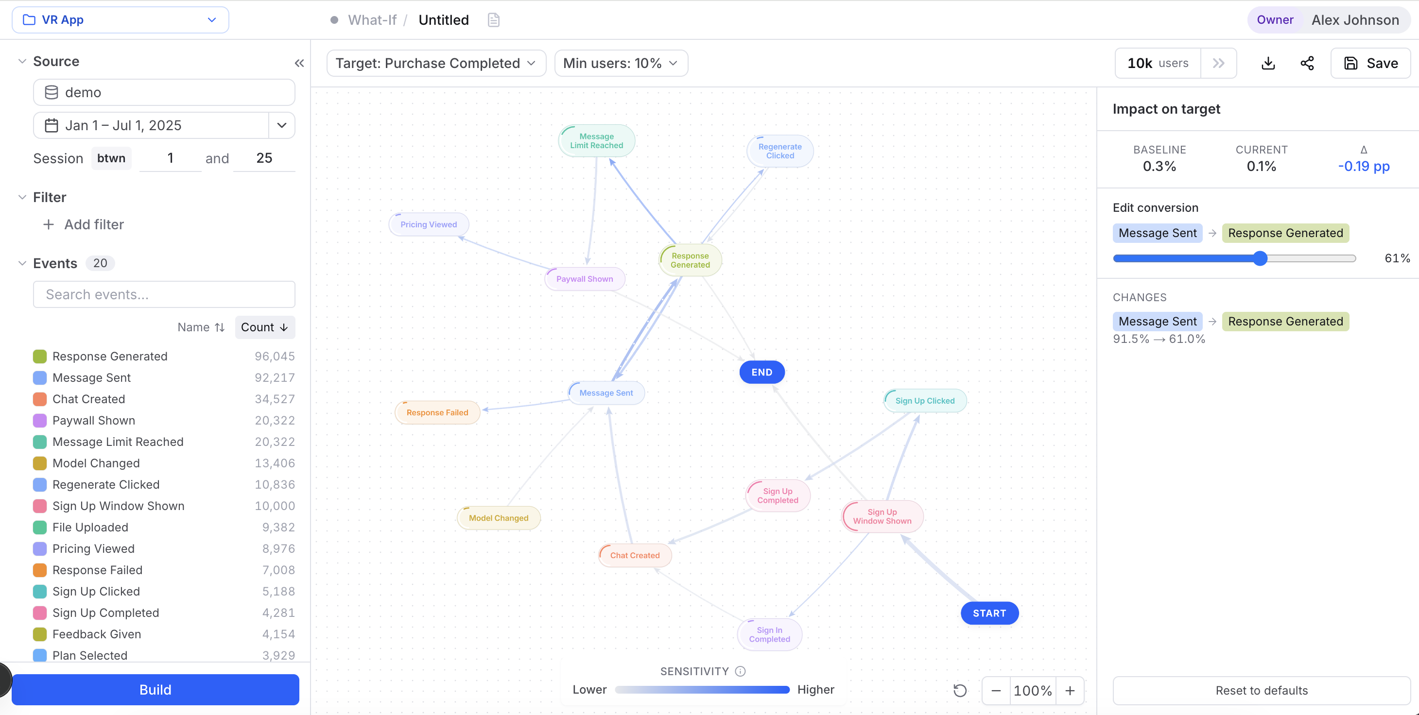
Here's where the simulation happens. Click any edge to open the Edit conversion editor in the right panel.
The Changes log
Every adjustment is recorded under Changes as old% → new%, so you always know what your scenario assumes. Before you touch anything, it reads: "Click an edge and adjust its conversion to see the effect on reaching the target."
Edits interact — raise one transition and its siblings renormalize — so a fixed "this edit added X pp" would mislead you. The one figure you can trust is the cumulative Δ at the top of the Impact panel.
Reset your edits
Click Reset to defaults at the bottom of the panel to clear every edit and snap all transitions back to their measured rate. The button is disabled when you have no edits.
Warnings to watch for
Two guardrails can pop up. Both are expected on tricky graphs, not errors:
- Stranded state — "These edits leave a state with no path to the target or exit — result withheld." Your edits created a dead end: users can land in a state they can never leave to reach the goal or exit. The result is withheld because it's undefined. Ease off the change or pick a different edge.
- Ill-conditioned graph — "Graph ill-conditioned — leverage coloring suppressed." The math behind the sensitivity ranking couldn't settle on a stable answer, so Cohortum drops the leverage coloring rather than show you misleading colors. You can still edit and read the Impact panel.
A What-If scenario assumes the rest of the graph keeps behaving the same when one transition changes. Real users don't always play along. Treat the Δ as a prioritization signal — "this lever is worth chasing" — not a revenue forecast.
Save, share, and export
A What-If scenario is a first-class analysis. From the top toolbar you can:
- Save it, so the target and every edit come back exactly as you left them. Saved scenarios show up on the Saved page with Whatif in the Level column.
- Share link — copies an in-app link to a shared snapshot your teammates with source access can open.
- Export as PNG — captures the canvas exactly as edited, scenario changes and all, for a slide or doc. The Reset button and zoom controls are stripped from the image.