The side panel
Select anything on a chart and the right side panel breaks it down — Funnel, Users and Properties — then turns that slice into a reusable cohort.
Click anything on a chart and a panel slides in from the right to explain it. Every graph tab shares this one panel, and it answers three things about whatever you picked — how it converts, who's in it, and what those people look like — then saves it as a cohort with one click.
When it opens
The panel always describes what you've selected on the tab you're on.
- Steps — click a block or prefix to pick the path from START down to it.
- Transitions and Journey — click a node or an edge.
- Clusters — click a cluster.
What-If is the odd one out. It swaps this panel for its own Impact on target panel where you edit edge conversions. Everything below is about the Steps, Journey, Transitions and Clusters tabs.
The three tabs
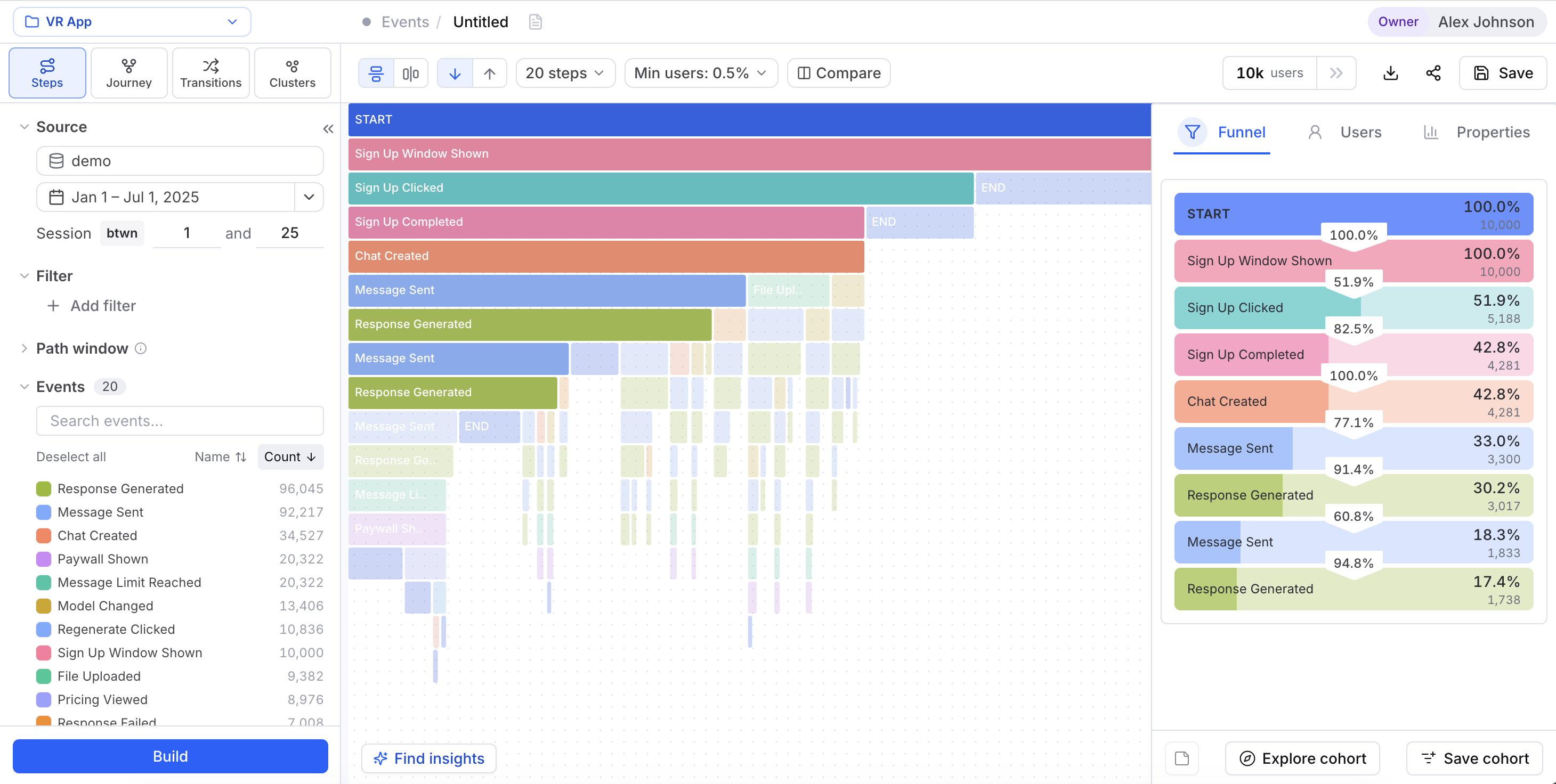
Funnel
The Funnel tab walks your selection step by step — the user count and conversion rate at each stage, from START through the exact sequence you picked. It's where you spot the drop-offs along that path. Over in the Clusters tab this first tab is called Cluster instead, and it lays out the event patterns that define the cluster you clicked.
Users
The Users tab shows you the actual people in your selection, one at a time. Use the arrows in the tab header to page through them. Each person has two sub-tabs:
- Activities — their real event timeline: every event they fired, in order. Each row wears a badge with the time to the next event, so you can see where they raced ahead or stalled out. Click any event to expand it and read its properties (
video_id,page_number, that kind of thing). - Properties — the person's own attributes, like
countryorplan.
This tab plays along with Compare: turn on an A/B split and every user gets a Group A / Group B label, so you can tell the two sides apart.
Properties
The Properties tab shows how your selected users spread across event and user properties — the split by country, plan, and so on — so you can size up the segment in one glance. A toggle changes what each bar measures:
- Share — each value's share within your selection: what this segment actually looks like.
- Normalized — each value weighted against its overall base rate, so the bars surface what over-indexes in the selection — who's most likely to reach this path, not just who shows up most. This one leans on extra denominators computed at build time. If it's greyed out, rebuild the chart to switch it on.
Turn a selection into a cohort
The footer takes a one-off selection and makes it something you can reuse anywhere.
Saves the selection as a private cohort and opens a fresh analysis scoped to just those users. Reach for it when you want to look, not curate — the cohort still shows up in User Cohorts afterward.
Saves the selection as a named segment in User Cohorts, tagged with its origin (Steps prefix, Transition node/edge, Journey, or Cluster) so you can always trace where it came from. Pick its visibility — Private or Shared — as you save.
Add a note
Add note in the footer lets you jot down your read of a selection so teammates see it too — "this is where trial users stall," say. It only lights up on a saved analysis you can manage. A draft has nothing durable to pin the note to, so save the analysis first.
In Sessions Analysis, the Users and Properties tabs flip to session views — they describe sessions instead of raw events. The Funnel tab and the cohort actions behave exactly the same.