Steps
Read the Steps chart to see the most common paths users take from a start point and exactly where they drop off, step by step.
Steps is the first tab in every analysis workspace, and it turns your raw event log into a step-by-step path tree. It's a modified take on the familiar Sankey diagram — reworked to trace long chains of steps and let you analyze them in depth, rather than just showing a few flows side by side. You get to see the routes users actually take through your product — and where they fall away.
What the Steps chart shows
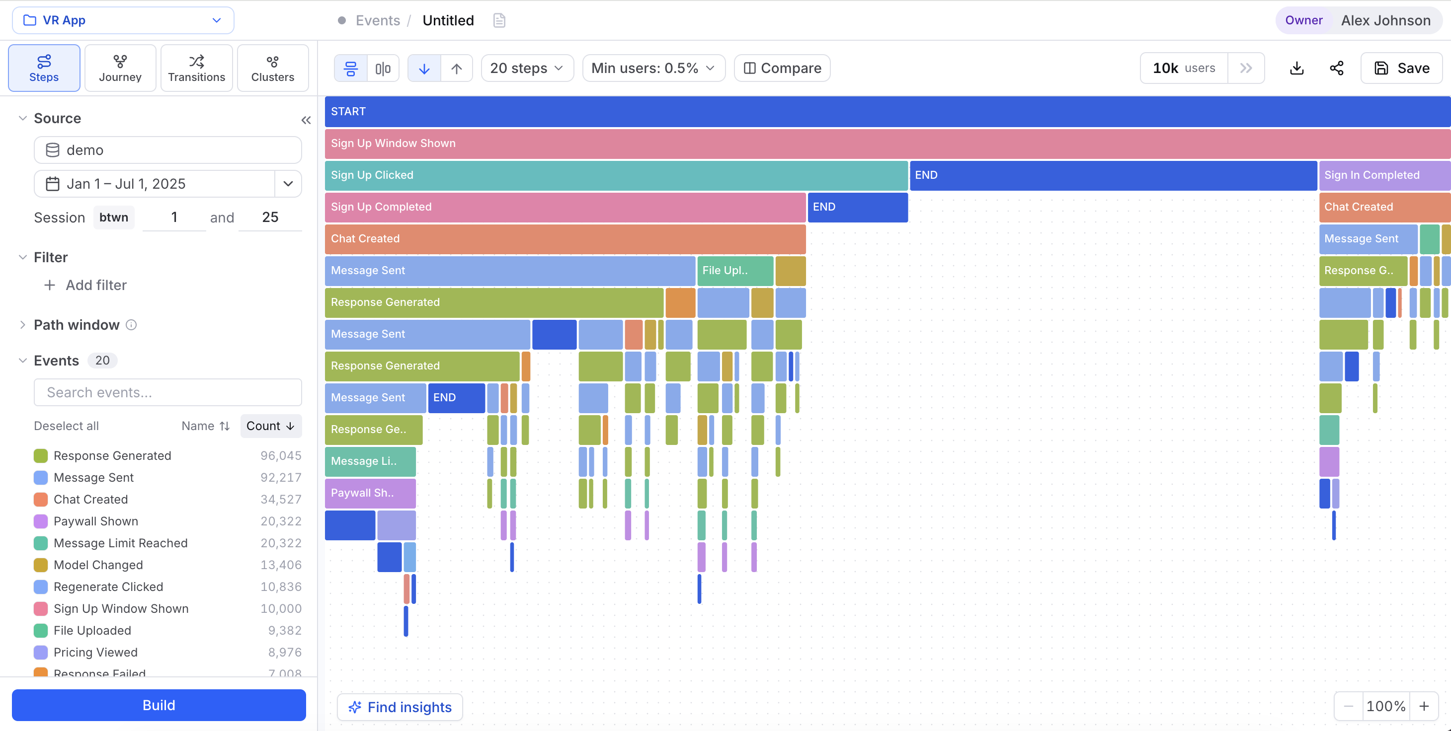
Picture a tree that grows one step at a time down from a START row. Each column is a step. Each colored block is an event, and how wide a block is tells you how many users reached that event at that step. As users branch onto different next events or just stop, the blocks below get narrower. That shrinking width is the drop-off.
You never pick the steps ahead of time — Cohortum builds the tree from your data. It starts with the most common first event, then the most common events that followed it, and keeps going. So the tree fans out across every path that matters, not just the one you guessed.
How to read the Steps chart
Three habits get you most of the way:
- Follow the widest chain. The blocks that stay wide from START on down are your most-traveled path. That's what most people actually do — often not the flow you designed.
- Watch where a block narrows sharply. A step much thinner than the one above it is where users drop off. If "Video clicked" leads into a step where only a sliver continues to "Page pagination clicked," that gap is where you're losing people.
- Compare siblings. When one event splits into several next events, the relative widths tell you which branch wins. A fat branch next to a thin one out of the same block is a preference signal.
Widths are proportional, so eyeballing gets you the shape. Hover any block to see its event name, precise user count, and the step-to-step conversion from the block above it.
Steps vs. Transitions vs. Journey
Steps, Transitions, and Journey all show how users move through your product, but each one answers a different question. Grab Steps first when you want a single full path traced from one start point.
| Steps | Transitions | Journey | |
|---|---|---|---|
| Unit | One full prefix path from START | Pairwise event → event hops | Frequent multi-step paths |
| Drop-off | Shown per step as narrowing width | Shown per edge weight | Shown along mined routes |
| Best for | Where a single flow leaks, step by step | Exactly what follows a given event | The overall shape when paths branch and remerge |
Grab Transitions when all you care about is the immediate next step from any event. Grab Journey when paths branch and remerge a lot and you want the common multi-step sequences instead of a strict prefix tree.
The Steps toolbar
The controls across the top of the canvas reshape the chart without touching your underlying filters:
| Control | What it does |
|---|---|
| Orientation toggle | Switch between Vertical view (steps flow top-to-bottom) and Horizontal view (left-to-right). |
| Direction toggle | Forward grows the tree from the start event onward; Backward grows it from an endpoint back in time, so you can ask "what led up to this?" |
N steps | Sets how many steps deep the tree goes (default 20 steps). Fewer steps keep it readable; more reveal long paths. |
| Compare | Opens the Compare dialog to color the chart by two groups or a numeric split. |
| Users count | A live count of the users in the current view, e.g. 8.4k users. |
| Export as PNG | Downloads a framed image of the chart (see Export as PNG). |
| Share link | Copies an in-app link to a snapshot of the current state (see Share links). |
| Save | Saves the analysis so you can reopen or share it later. |
You won't find the Min users: N% threshold here — it lives on the Transitions and Journey tabs. On Steps, the step count and direction control density instead.
Build and Find insights sit in a bar at the bottom of the workspace. Nothing in the toolbar or left panel takes effect until you click Build — more on the two buttons below.
The left panel: scoping your data
Every tab, Steps included, is scoped by the same collapsible left panel: the Source, date range, Session range, the Filter block, the Path window, and the Events checklist that decides which events become blocks in the tree. Only the events you include show up in the chart. See The left panel for a full walkthrough of every control and every filtering option.
Block colors and display names come from the Events catalog, where you can rename, recolor, and exclude events at Personal or Project scope. Recolor an event there and it changes across every visualization.
Drilling into a path
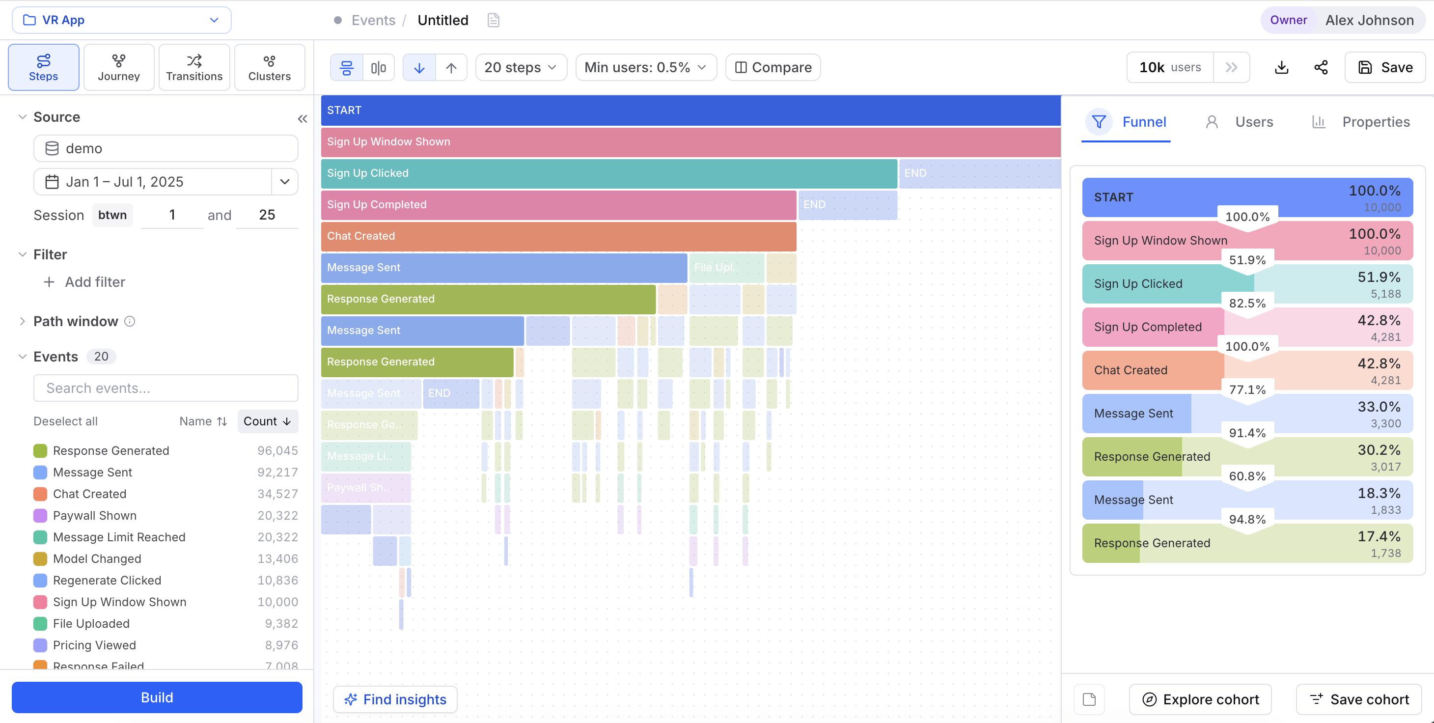
Any block or prefix in the chart is a real slice of users — the people who took exactly that sequence of steps. Select it to open the right side-panel, where you can turn that slice into something you'll reuse.
Build vs. Find insights
Two buttons sit at the bottom of the workspace, and they do different jobs:
- Build recomputes the chart after you change the source, filters, events, step count, or direction. While it runs, the label reads Computing…. Nothing in the toolbar or left panel takes effect until you build.
- Find insights turns Cohortum's own insight engine loose on the current view, surfacing standout patterns you'd likely miss by eye — say, a step where one cohort over-indexes, or a metric that runs unusually high on a branch. The button counts what it found (
3 insights) or tells you No insights found.
Events level vs. Sessions level
Steps shows up in both Events Analysis and Sessions Analysis — separate entry points in the left nav. At the Events level, each block is a raw event. At the Sessions level, the same chart is built on session types, so a step stands for a kind of session rather than a single event.
The reading rules — follow the widest chain, watch for sharp narrowing, compare siblings — carry over unchanged. Two scoping controls differ:
- Path window disappears entirely at the Sessions level.
- The per-event Events checklist becomes a session types list, so you include and exclude kinds of session rather than individual events.
Everything else in the left panel and toolbar works the same at both levels.
Reading an example
Here's how the pieces come together on a typical onboarding investigation:
country = US. Click Build.START → Signed up → Created project. Below Created project the tree narrows hard: of the 4.2k users who created a project, only 900 reach Invited teammate at the next step. That collapse is your leak.Created project block to select the START → Signed up → Created project prefix. The right side-panel opens with the 4.2k users and their exact sequence.Related
Journey
Mine the full user-flow DAG when paths branch and merge.
Transitions
See event-to-event flow as a weighted node-edge graph.
Compare
Color the Steps chart by two groups or a numeric split.
User Cohorts
Manage the segments you save from a drill-down.
The side panel
Read a selection (Funnel, Users, Properties) and save it as a cohort.