Journey
Read the Journey view in Cohortum — a user-flow graph that finds the multi-step paths users repeat and collapses them into one readable map.
Journey is Cohortum's standout view. Feed it your raw event log and it automatically discovers the journeys your users actually take. It mines the multi-step sequences people repeat, quietly prunes away the rarer, less telling events that only add noise, and compresses what's left into a single, readable map of the real path through your product. Most analytics tools can only tell you what happened right after one event; reconstructing the whole journey this way is a genuine piece of know-how you won't find anywhere else. Reach for it when you want the shape of the entire journey — not one hop at a time.
Journey is the second of the four tabs in Events and Sessions analysis workspaces, sitting between Steps and Transitions.
What the graph shows
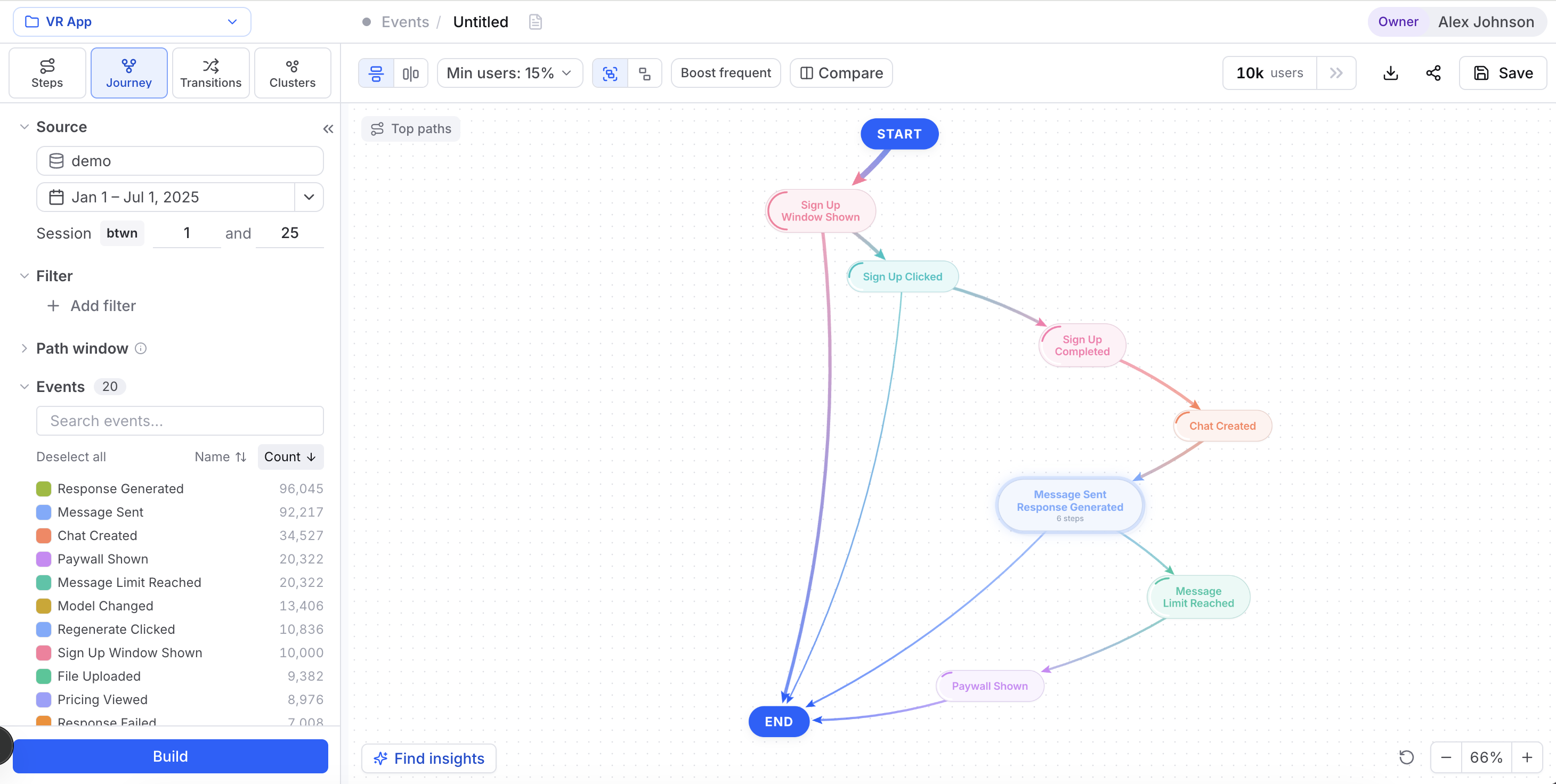
Each node on the canvas is an event, and each edge is a step users take from one event to the next. The busier a route, the louder it reads: node size and edge weight both scale with how many users travel it.
How it differs from Transitions
Journey and Transitions both draw a graph of events, but they answer different questions.
| Journey | Transitions | |
|---|---|---|
| Unit | Frequent multi-step paths | Pairwise event → event hops |
| Method | Recurring multi-step paths | Pairwise event-to-event counts |
| Best for | The overall shape of common journeys | Exactly what follows a given event |
Think of Transitions as a street-level map of every intersection, and Journey as the highlighted commuter routes most people actually drive.
Journey shows you what the dominant paths are; What-If lets you simulate fixing one. When a path here looks weak, pick a goal event in What-If and nudge the transition's conversion to see how much it would move your overall goal-reach.
Controls
Journey gives you a few knobs in the top toolbar. Set them, then hit Build to recompute.
Min users %
The Min users: N% pill sets the floor: the smallest share of users a path needs to show up. Anything below that percentage gets dropped from the canvas.
Raise it to declutter down to the trunk routes. Lower it to surface longer-tail branches. If the canvas comes back empty, this is the first dial to turn down.
Boost frequent
The Boost frequent toggle changes how the flow is ordered. Turn it on and Cohortum builds the journey around what most users did, busiest events first. Turn it off and the flow follows the clock instead, earliest events first — closer to real chronology.
Turn Boost frequent on to see where the crowd goes. Turn it off when the timing and sequence of events matters more than raw volume.
Collapse and expand groups
When the same event shows up at several points in the flow, those repeats clutter the view. Collapse groups folds every run of a repeated event into one grouped pill; Expand groups breaks them back into individual nodes. It's a whole-graph toggle, and it only touches the layout — the paths and counts underneath don't change.
Top paths
The Top paths button (bottom-left of the canvas) opens a ranked list of the most common end-to-end journeys. Each entry shows its share of users and the raw user count, with a pager to step through them one at a time. It's the fastest way to read the graph as plain sequences — and you can save any path straight to a cohort from here.
Build vs. Find insights
Two buttons drive the analysis, and they do different jobs:
- Build recomputes the DAG after you change the source, filters, events, Min users %, or ordering. Nothing in the toolbar or left panel takes effect until you build.
- Find insights turns Cohortum's own insight engine loose on the current view, surfacing standout patterns you'd likely miss by eye — say, a path or node where one cohort over-indexes, or a numeric metric that runs unusually high along one branch. The button tells you what it found (
3 insights) or reports No insights found.
Drill into a node or edge
Click any node or edge to open the right side-panel. It has a Users tab — the individuals behind that selection, with their activity — and a Properties tab that shows how their properties are distributed, so you can see who they are and what else they did.
From the panel footer, turn that selection into a saved segment:
If you're working inside a saved analysis you can manage, the panel also offers Add note to pin an annotation to a node or edge for your team.
Compare cohorts side by side
Use the Compare button in the toolbar to color the graph by two groups or a numeric split. Define Group A and Group B with filter builders (with an optional complement and a Normalize groups toggle), or pick a numeric field. The recolored graph shows you where two audiences diverge through the same flow. Compare rides along in the shared link and saved analysis.
Events vs Sessions level
Journey works at two levels, and which one you get depends on the workspace you open from the sidebar:
- Events Analysis mines journeys over your raw events.
- Sessions Analysis mines them over session types — a mapped, higher-level view of what a session was about. The Sessions workspace adds a Mapping button (in the Sessions panel) that opens the Edit session types editor.
The controls are the same at both levels; only the unit of the flow changes.
Reading an example
Say you build Journey on a media source with Min users: 15% and Boost frequent on. The graph shows a fat trunk: Home viewed → Video clicked. From there it forks — most users carry on to Page pagination clicked, but a thinner edge peels off to Search submitted.
Open Top paths and you see the top route covers 42% of users, while the search branch is only 9%. Click that thinner edge, and the side-panel shows those users skew toward longer sessions. Save them as a cohort, then head to Clusters to see whether they form a distinct behavioral segment worth designing for.
Related
Transitions
Pairwise event-to-event flow and the N×N matrix view.
What-If
Simulate how fixing a path's conversion moves goal-reach.
Clusters
Group users into behavioral segments by how they behave.
Steps
Trace step-by-step drop-off from a starting event.
The side panel
Read a selection (Funnel, Users, Properties) and save it as a cohort.
Filters
Scope every tab: source, dates, session range and filters.