Transitions
Read the Transitions graph to see how users flow between events, spot loops and dead ends, and turn any edge into a cohort.
Transitions answers one question: after users fire an event, what do they do next — and how many take each path? You get that flow for every event.
Open it from any analysis workspace — it's the third tab, Steps · Journey · Transitions · Clusters. Pick a source and date range on the left, then click Build.
What the graph shows
You get a directed graph by default. Each event node is a circle, and a curved edge runs from one event to the event that followed it. Two gray pills anchor the flow:
- START — where sessions begin (the first event users fire).
- END — where sessions end (the last event before users leave).
Thicker, more saturated curves carry more users; thin faint ones carry few. So the widest ribbon leaving a node is the most common next step, and the ribbon into END shows you where people drop off.
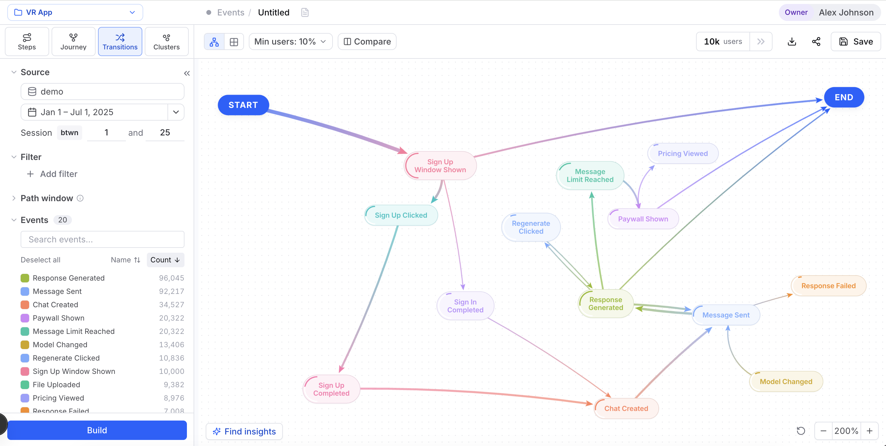
Self-loops mean repeats
A self-loop is an edge that leaves a node and curves right back into it — users firing the same event again before doing anything else. A heavy self-loop on "Page pagination clicked" or "Video clicked" is telling you something: people keep repeating an action instead of moving on. Sometimes that's healthy engagement. Sometimes they're stuck.
Reading the flow
Train your eye on three patterns:
- Dominant paths. Follow the thickest ribbons out of START. They trace the route most users actually take — often not the one you designed.
- Unexpected transitions. An edge between two events you didn't expect to connect usually means a shortcut, a confusing UI, or an instrumentation quirk worth checking.
- Loops and dead ends. Self-loops flag repeated actions; a fat edge straight into END flags an exit point. Both deserve a closer look.
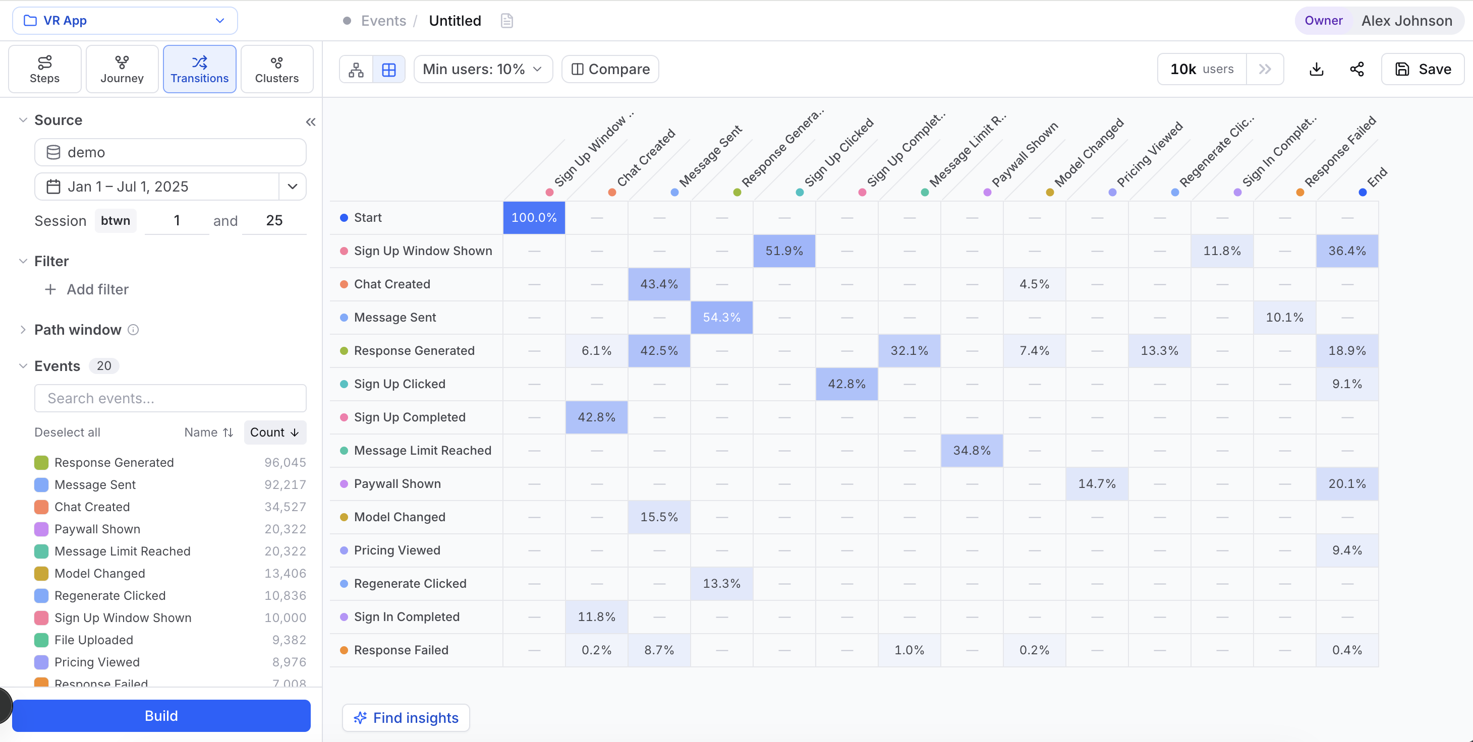
The graph is great for shape and outliers, but on high-traffic sources the curves overlap and get busy. When you need exact numbers per pair, switch to the matrix.
The matrix view
The toolbar has two view toggles: Transition graph and Transition matrix. The matrix is an N×N grid — one row per source event, one column per target event. Each cell is shaded by the share of users who made that transition, so a dense diagonal or a bright column jumps out. Hover a cell to see the volume behind it.
Reach for the matrix when you have a lot of events, when the graph's curves overlap, or when you'd rather scan every source-to-target pair systematically instead of by eye.
Transitions controls
The toolbar and left panel give you a few levers to focus the view:
| Control | What it does |
|---|---|
| Min users: N% | Prunes low-volume transitions — edges below the threshold disappear so the graph stays readable. Raise it to keep only the highways; lower it to see the long tail. If the canvas comes back empty, turn this dial down first. |
| View toggle | Switches between Transition graph and Transition matrix. |
| Compare | Overlays two cohorts (Groups A/B, with an optional complement and Normalize) or a numeric split, then recolors both the graph and the matrix to show how their flows differ. See Compare for the full workflow. |
| Users count | The header shows how many users are in the current view (e.g. "8.4k users"), reflecting your source, date range, and filters. |
| Build / Find insights | Build recomputes the graph after a change; Find insights puts Cohortum's own insight engine to work, surfacing standouts like over-indexed transitions. |
Everything on the left panel — the Filter builder, Path window, and the Events list — narrows the population before the graph is computed, just like on the other tabs.
Drill into a node or edge
Click any node or edge to open the right side panel. It has a Users tab (the individual users behind your selection, with their activity and properties) and a Properties tab (how those users' properties break down).
Two footer actions turn a selection into a reusable segment:
On a saved analysis you can manage, the panel also offers Add note to annotate a specific node or edge for teammates.
Events level vs. Sessions level
Transitions runs in both Events Analysis and Sessions Analysis, two separate entry points in the left nav. At the Events level, each node is a raw event. At the Sessions level, the same graph is built on session types instead — a node is a kind of session, and START, END, self-loops, and edges all describe how users move between session types rather than between events. The Sessions workspace adds a Mapping button (in the Sessions panel) that opens the Edit session types editor. You read it the same way at both levels; only the unit changes.
Transitions vs. Journey vs. What-If
All three describe movement between events, but they answer different questions:
- Transitions is pairwise: for a single event, where users go next and how much traffic takes each path. Use it to spot immediate next-steps, loops, and exit points.
- Journey is multi-step: it finds whole recurring sequences (A → B → C → D) rather than one hop at a time. Reach for it when you care about the shape of an entire path, not just adjacent pairs.
- What-If is counterfactual: pick a goal event, then nudge individual transition conversion rates to see how overall goal-reach moves. Use it after Transitions has shown you which edges look weak — What-If tells you which one is worth fixing first.
A good workflow: start in Transitions to find a suspicious edge, confirm the surrounding path in Journey, then test the upside in What-If.
Unlike Journey, What-If isn't a tab in this workspace — it's a separate analysis level you open fresh from the left nav, and it always works on session transitions. Your current filters and the edge you were looking at don't carry over, so you re-select the goal event and rebuild there.
Related
Journey
Mine multi-step paths and recurring sequences.
What-If
Simulate how fixing a transition moves goal-reach.
User Cohorts
Save any node or edge as a reusable segment.
The side panel
Read a selection (Funnel, Users, Properties) and save it as a cohort.
Filters
Scope every tab: source, dates, session range and filters.