Export to PNG
Turn any Cohortum chart into a clean, framed PNG with a title and subtitle baked in — ready for a slide, a doc, or Slack.
Sometimes a picture beats a link. Any analysis view in Cohortum drops straight into a framed PNG, title and subtitle already baked in — the same image works in a deck, a doc, or a design review, and you never crop a browser screenshot by hand. Grab a PNG when you want a static, dated snapshot. When people should poke at the data themselves, send a share link instead.
Export a chart as an image
Look for the Export as PNG button in the top toolbar of any analysis workspace — it's the download icon, just left of the share and save controls. It works on all four visualization tabs (Steps, Journey, Transitions, Clusters) and on the What-If canvas.
Build the view first. Pick your source, date range, filters, and — if you want it in the shot — a Compare overlay. Whatever's on screen and done building is what you get.
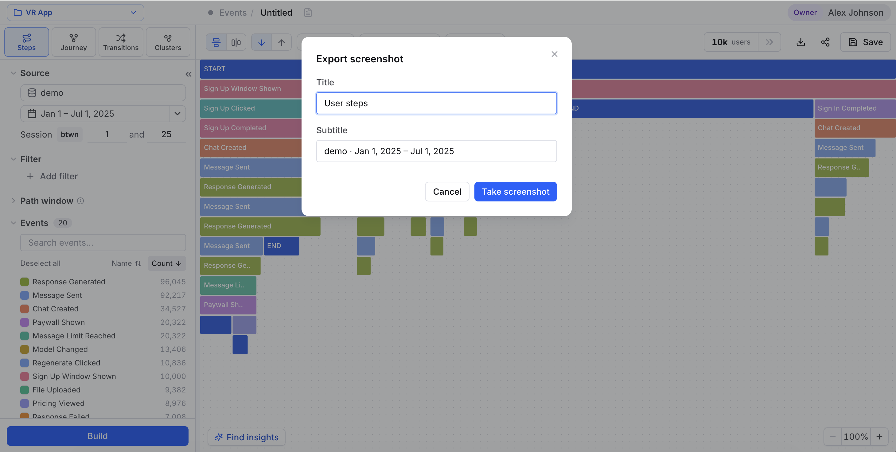
The download icon opens the Export screenshot dialog. It stays greyed out until you've connected a source and the chart has finished loading, so let the chart render before you click.
Both fields come pre-filled, and you can edit either one. The title starts as your analysis name, or a per-tab fallback like "Event transitions". The subtitle starts as the source name and date range, e.g. Mobile App Production · Mar 1 – Mar 6, 2026.
The button reads "Capturing…" while it renders. When it's done, the PNG downloads and the dialog closes. If the capture fails — rare, and usually on huge graphs — you'll get an error toast. Just try again.
What the PNG captures
You get the chart, not the app around it. The right-hand detail panel, the zoom controls, hover tooltips, and any popovers all drop out, so the image is just the visualization — nothing else. On the Transitions tab, the export matches whichever sub-view you're looking at, graph or matrix, so switch to the one you want first. Each view renders the way it reads best:
| View | What is captured |
|---|---|
| Journey, Transitions (graph), What-If | The full node-edge graph at 1:1 scale — every node at natural size, not the fit-to-view zoom |
| Transitions (matrix) | The complete N×N table, including rows and columns scrolled out of view |
| Steps | The full step tree with overlays and zoom controls removed |
| Clusters | The cluster point clouds as shown on the canvas |
That 1:1 graph capture is the whole trick. Cram a busy Journey or Transitions graph into the on-screen viewport and it exports as an illegible blur, so Cohortum measures where the nodes actually sit and draws the whole thing at full size.
Turn on a Compare overlay and its color scale gets redrawn as its own labeled row inside the frame. The image explains its own colors — you don't need a caption to spell them out.
Images render at up to 3× pixel density, so text and hairlines stay crisp when someone zooms in or the slide hits a big screen. A really large Journey or Transitions graph may drop to a slightly lower ratio to stay under the browser's canvas-size limit.
Tips for decks and docs
- Give it a real title. The default is fine, but a specific title — "Checkout drop-off, mobile, last 7 days" — turns the image into a slide that stands on its own.
- Put the context in the subtitle. Source and date range land there by default. Leave them, so whoever finds the picture three months from now knows what it is and when it's from.
- Show the comparison in the picture. If the slide is about A vs B, turn on Compare before you export so the color legend rides along with the image.
- Pair the image with a live link. A PNG is a snapshot. When people will want to dig in, drop a share link next to it so they can open the interactive version.
A PNG freezes the moment you export it — it won't move as new events load. When you need a view that always shows the latest data, save it as an analysis and share the link instead.