Quickstart
Go from a raw event log to your first saved analysis — add a source, let it load, and read the Steps chart.
1. Add a source
A source is the event log you upload — a CSV or Parquet file where every row is a single event like Video clicked or Page pagination clicked, tied to a user and a timestamp.
In the left sidebar, click Sources, then New source. No Sources in the nav? Your role can't upload data — ask a workspace Admin to add the source for you.
On the Source step, give it a name you'll recognize later, like "Mobile App Production," and choose CSV or Parquet.
On the Upload step, pick your event log. Cohortum reads the header so it can set up the next step for you.
On the Mapping step, Cohortum maps what it recognizes and pops a toast like "Auto-mapped N columns — review the mapping below." Double-check that the three required fields — Event Name, User ID, and Timestamp — point at the right columns. Anything left on Ignore stays out of the import.
On the Sessions step, we recommend pointing Cohortum at an existing Session column in your data whenever you have one — your own logs carry each user's full history, so the session numbering stays true. If you leave Auto-generate sessions on instead (a new session starts after N minutes of quiet, set with Session timeout (minutes)), Cohortum numbers the first session it sees for a user in the log as session 1 — which may not be their actual first session if the log doesn't start at the beginning of their history. Submit to finish.
Up pops the toast "Source created — importing your file." Want the field-by-field tour of column mapping and session options? See Upload your first source.
2. Wait for the source to finish loading
Loading happens in the background. On the Sources list, watch the Status column climb from loading to Loaded while Rows fills in with the event count it imported. Bigger files take longer, and you don't have to sit on the page while they load.
If Status flips to Failed, click the source to read the error. Recheck your column mapping or re-upload — Upload your first source covers the usual culprits.
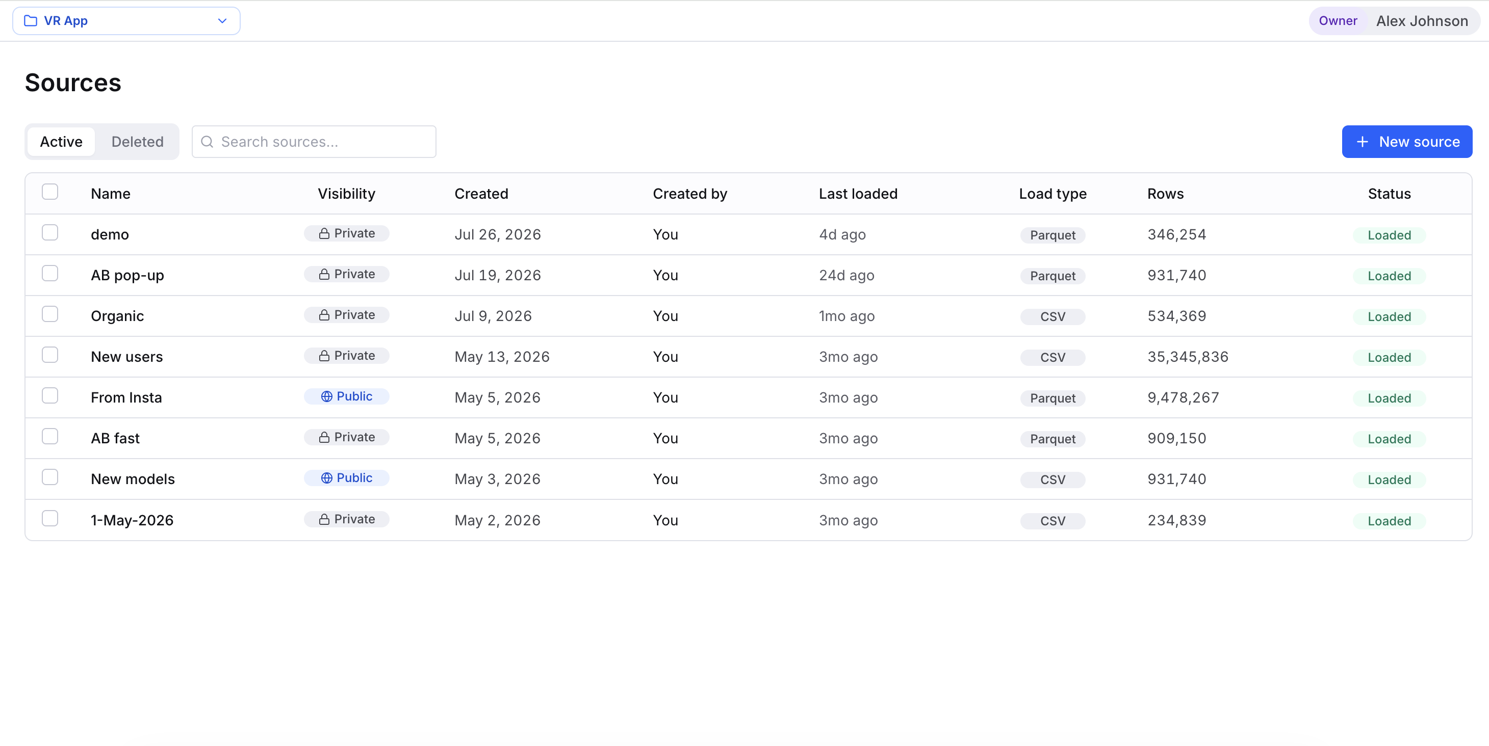
Loading keeps going even after you navigate away. Go do something else and check back — once the status reads Loaded, you can query the source anywhere.
3. Open Events Analysis
With a source loaded, click Events Analysis in the sidebar to open the analysis workspace.
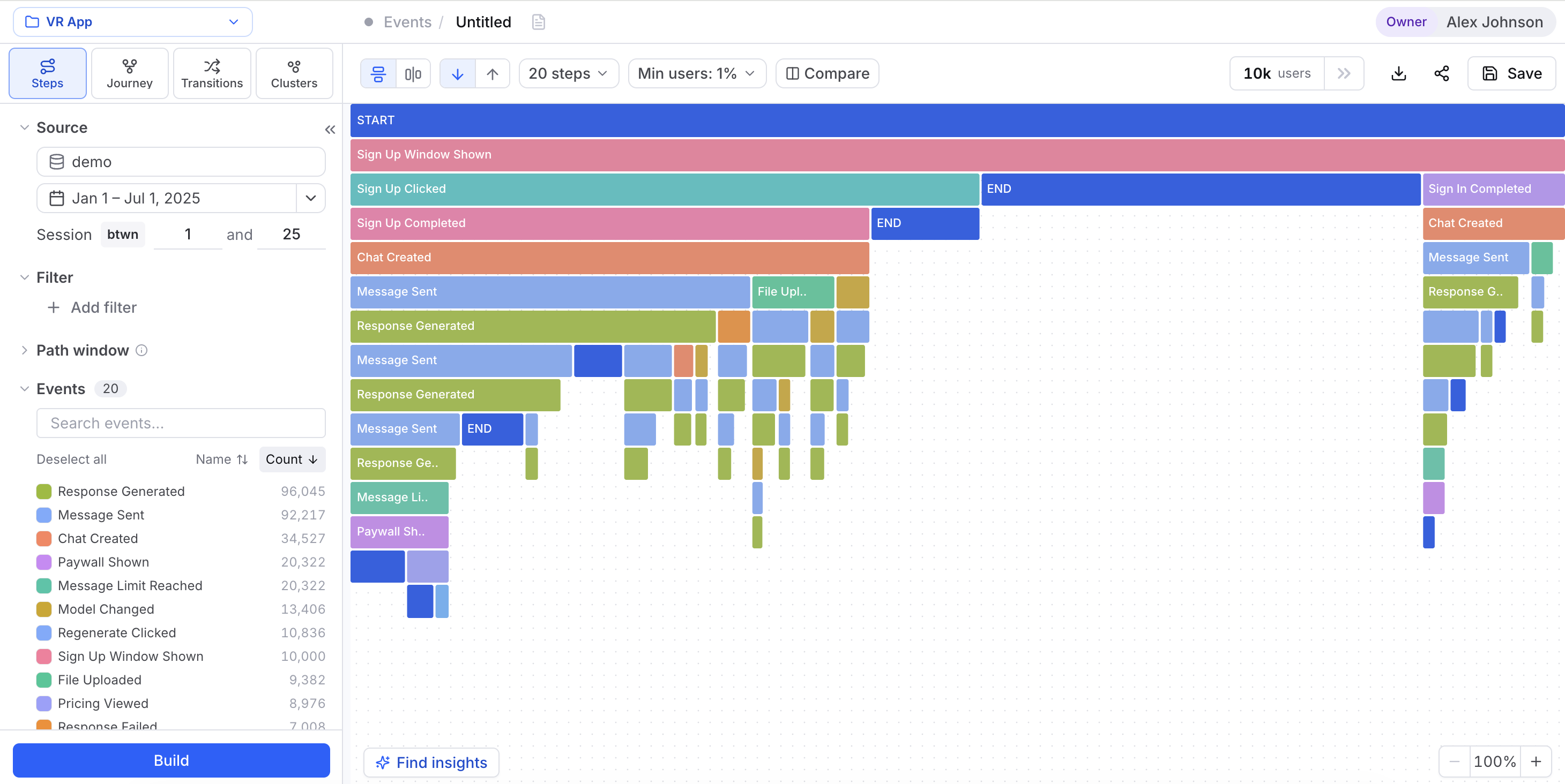
You get a filter panel on the left — a Source picker with a date range, plus Filter, Path window, and the Events list — and four visualization tabs across the top: Steps · Journey · Transitions · Clusters. Make sure your new source is the one selected in the Source picker, then hit Build to compute the first result.
4. Read your first Steps chart
Steps is the default tab and the quickest way to see what users do. It draws a step-by-step path tree: a START row at the top, and every row below it is the next step users took, shown as colored blocks whose width tracks how many users made it that far.
Read it top to bottom. Wherever a block gets much narrower than the row above, that's drop-off — the users who didn't continue. A wide block that keeps flowing down is a well-traveled path. Click any block to drill into that prefix and open up the paths that follow.
5. Tune the view and explore other tabs
Two toolbar controls shape what Steps shows:
- Min users: N% — hides steps too few users reached, so the chart stays readable. Raise it to zero in on the main paths; lower it to surface the long tail.
- Step count (say "20 steps") — how many steps deep the chart draws.
Change either one and click Build again to recompute. For a different angle on the same data, switch tabs:
| Tab | What it answers |
|---|---|
| Steps | Where do users drop off along their path? |
| Journey | What are the most common end-to-end flows through the product? |
| Transitions | Which events lead to which, and how strongly? |
| Clusters | Which behavioral segments emerge from the data automatically? |
To zoom any tab in on a slice of users — a date range, one event, a property value — reach for the left Filter panel. Filters has the full builder.
6. Save the analysis
Got a view worth coming back to? Click Save in the toolbar. In the Save analysis dialog, name it — "Mobile Signup Funnel Q1," say — add an optional description, and pick a visibility:
- Private — only you see it, though anyone with a direct link can still open it.
- Shared — your whole team sees it.
Saved analyses show up on the Saved page, where you can reopen, rename, or share them whenever. The Level column notes which analysis mode built each one. You just used Events Analysis — Cohortum also has Sessions Analysis, a separate workspace mode that aggregates by session rather than the session settings you set on upload, and What-If for single-canvas scenario testing. Each gets its own sidebar entry.
Next steps
Upload your first source
The full column-mapping and session-setup walkthrough.
Read the Steps chart
Understand the Steps chart, drill-downs, and drop-off in depth.
Filter your data
Focus any analysis on the users and events that matter.
Explore Journey, Transitions & Clusters
Go beyond Steps with the other three visualization tabs.
Save and share analyses
Reopen, rename, and share the views your team returns to.