Compare
Split any Cohortum chart into two colored audiences — build A/B groups or split on a numeric field — and see the difference on every tab.
Compare paints your chart in two colors so you can watch one audience behave differently from another. Reach for it when a single number hides the story — when you want to know not just what users do, but who does it differently.
It works on every visualization tab in an analysis workspace — Steps, Journey, Transitions, and Clusters — and sticks with the analysis when you save it or share a link.
When to use Compare
A plain chart tells you "how do users move through my product?" Compare tells you "how does group X move through it versus group Y?" A few questions it's built for:
- Does a saved cohort of paying users reach checkout faster than everyone else?
- Do high-value users take a different path through the Steps chart than low-value users?
- Which transitions are stronger for mobile visitors than for desktop?
- Is Cluster 3 converting better than the rest of your users?
Open the Compare dialog
You'll find the Compare button in the top toolbar of any analysis workspace, just before the users count.
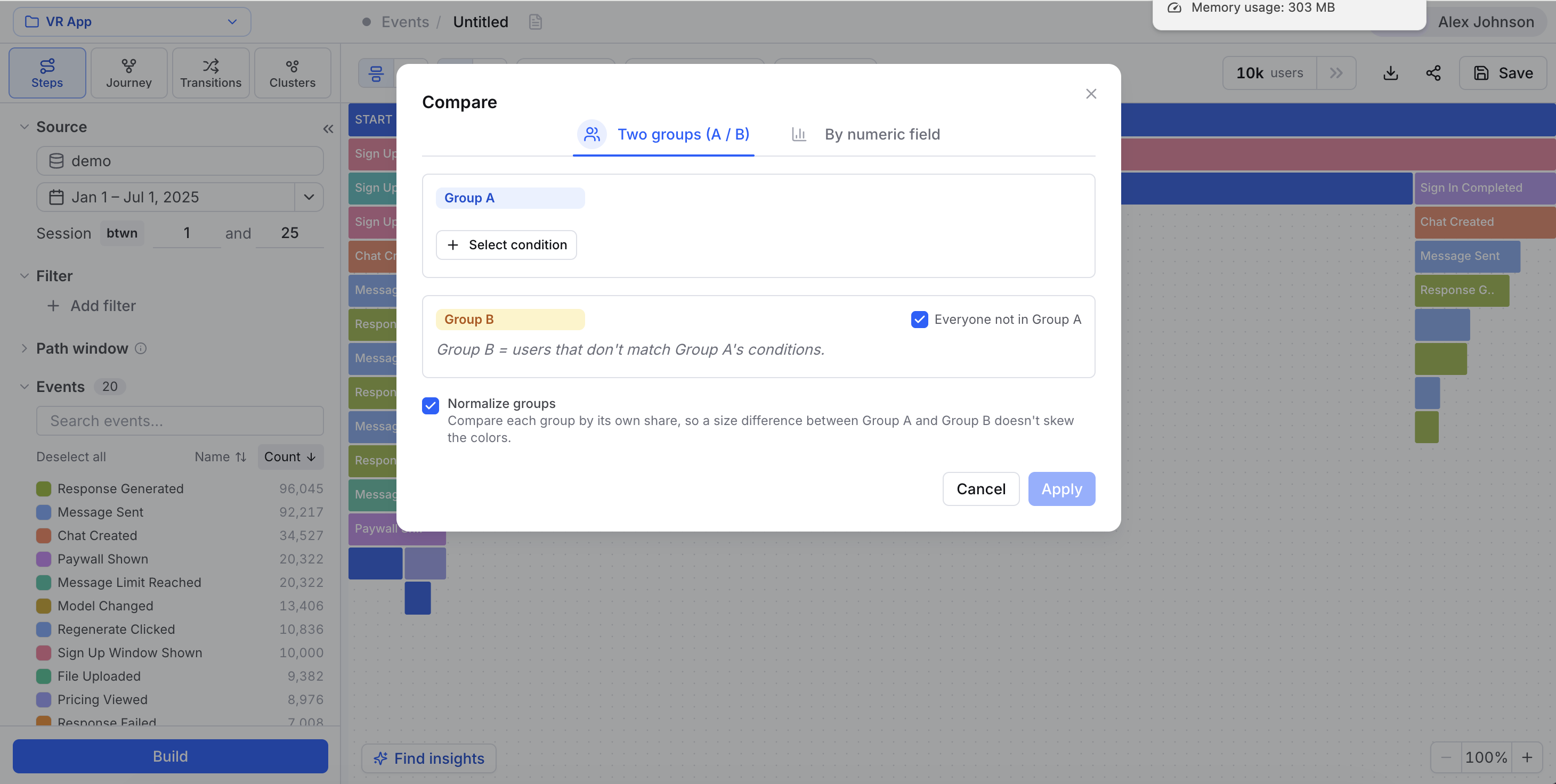
The dialog has two tabs — Groups and Numeric — one for each way to split your audience.
Both groups are computed within whatever base Filters are active in the left panel. Compare splits the filtered dataset; it never reaches past it. Narrow the Filters panel and you narrow both Group A and Group B at once. So set your base audience with Filters first, then split it with Compare.
Groups mode: A versus B
Groups mode lets you hand-build two audiences and lay them over each other. Each group is a little filter builder, exactly like the filters in the left panel.
Group B as the complement of A
Comparing a segment against "everyone else" is the comparison you'll make most, so there's a shortcut for it. Set Group B to the complement of Group A and you skip describing the second audience entirely — Cohortum fills it with every user outside Group A.
It's the fastest way to answer "how is this cohort different from the baseline?"
Normalize groups
When your two groups are wildly different sizes — 500 paying users against 40,000 free ones — raw counts make the smaller group look like a rounding error even when its behavior is more intense. Flip on Normalize groups to compare by proportion instead of volume, so a small, focused audience doesn't get visually swamped.
If you find yourself rebuilding the same Group A conditions over and over, save them as a cohort and reference it with a single cohort_id condition instead. See User Cohorts.
Numeric mode: high versus low
Numeric mode skips the builders altogether. Pick one numeric field and Cohortum splits your users into a high segment and a low segment on that value — no conditions to write.
Your choices are session duration, events per session, time on event, and any numeric user property you've mapped. time on event shows up only on Steps and Transitions — Journey and Clusters have no per-edge timing to split on, so it won't appear there.
Use it to pit the top of a spectrum against the bottom: high- versus low-value users, high- versus low-session-count, and so on. Pick the field in the Numeric tab and apply — the chart recolors into the two halves of the split.
How the split recolors the chart
Applying a comparison repaints whatever tab you're on, coloring each element by the group it belongs to.
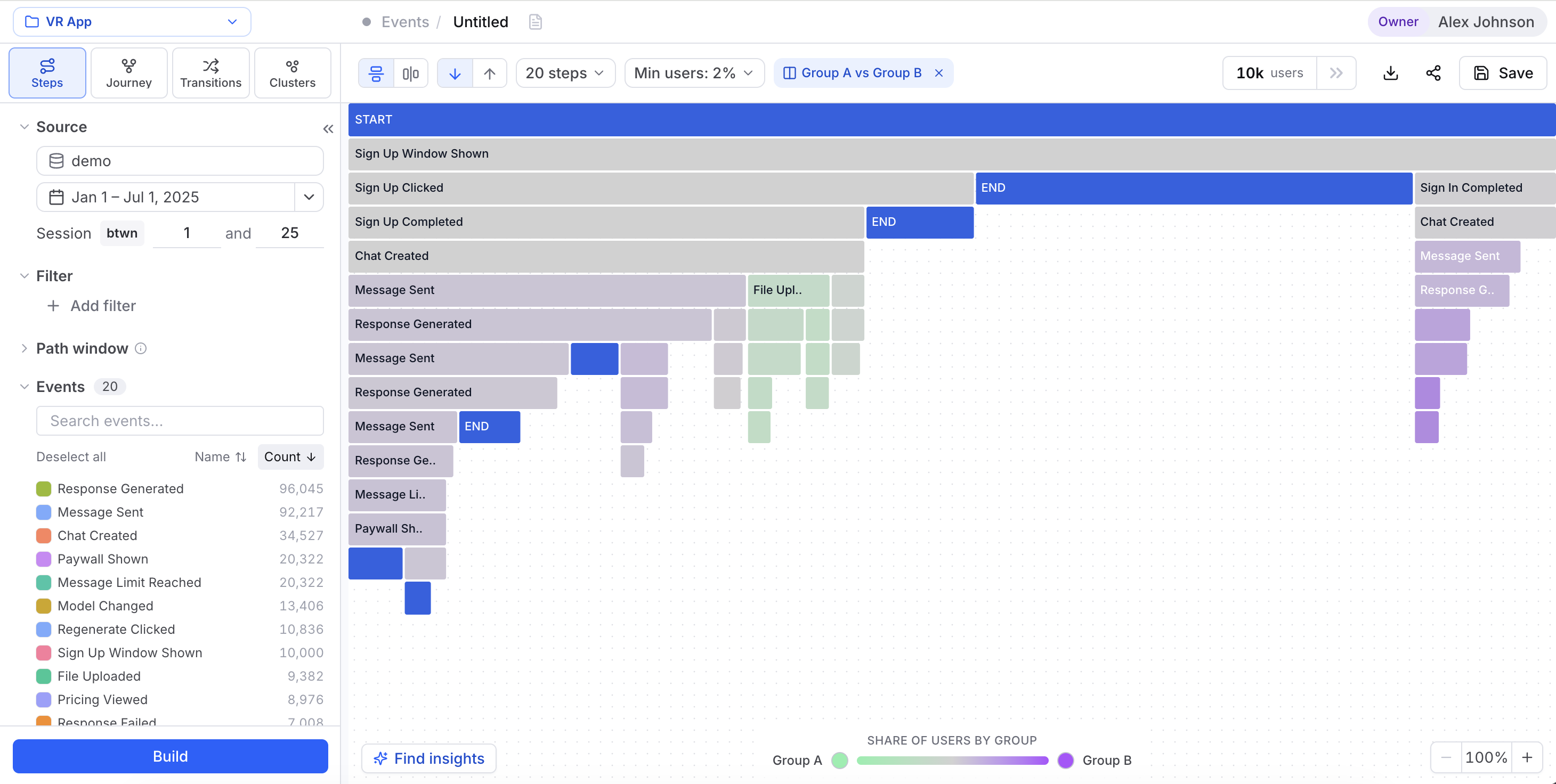
The look changes per tab, but the idea holds everywhere:
- Steps — each step block splits between the groups, so you can see where one audience drops off and the other keeps going.
- Transitions and Journey — nodes and edges show the two groups side by side.
- Clusters — points are tinted by group membership across the clusters.
Clearing or changing a comparison
Once a comparison is live, the toolbar shows a pill summarizing the split with a × button next to it. Click the × to clear the comparison in one click — no dialog needed. To change it instead, reopen the Compare dialog from that same pill and adjust the groups or the numeric field.
Compare in the Sessions workspace
The Sessions Analysis workspace has its own Compare dialog, tuned for session-grain data. Same idea, with three differences:
- time on event becomes time until next session.
- The cluster group condition isn't offered.
- Group conditions on events are membership-only — you match on whether an event happened, without per-event-property
whereclauses.
Everything else — Groups vs. Numeric, the complement shortcut, Normalize groups, the toolbar pill — works the same. See Sessions for how the session workspace differs overall.
Compare travels with your analysis
A comparison is part of the analysis, not a view you lose on refresh. So:
- Save the analysis and the comparison gets stored in its config, ready the next time you open it. See Saved analyses.
- Hit Share link and the recipient opens the exact split you set up — the comparison rides along in the shared snapshot.
An analysis holds a single active comparison — either a Groups split or a Numeric split — and it applies to the whole analysis, following you as you move between Steps, Journey, Transitions, and Clusters. One exception: a time on event numeric split resets when you switch to Journey or Clusters, since those views have no per-edge timing to split on. Group splits and every other numeric field carry over untouched. Switch modes in the dialog and the new split replaces the old one rather than stacking on top.
Related
Filters
Build the conditions that power each Compare group.
User Cohorts
Save an audience once and reference it in a comparison.
Saved analyses
Comparisons persist inside saved analyses and share links.
Steps
How the A/B split divides each Steps block.
Transitions
How groups recolor the node-edge graph.
Journey
How the split reads across the user-flow DAG.
Clusters
Compare one behavioral segment against the rest.